The A-Z of Beauty by i-D magazine

Video

This is a promotional video by i-D magazine – it is a show piece and it works.

'S, Smudge'

‘S, Smudge’


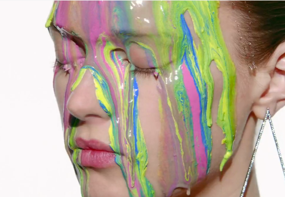
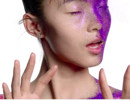
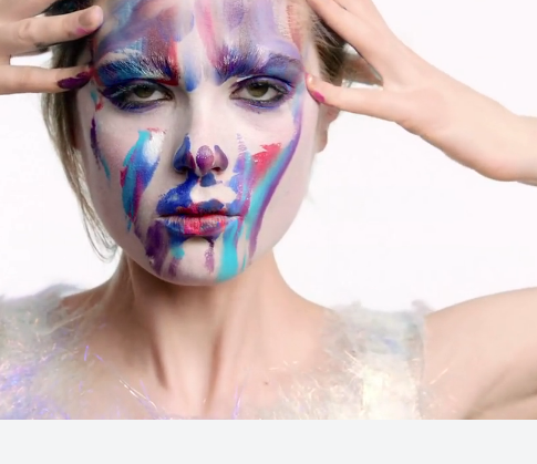
There is no overly complicated concept for you to think about, it’s fun and it looks cool and this is what makes it successful. After all, what is the point in over complicating something just for the sake of it? i-D are clear in their intentions for the video: ‘…Showcasing 26 make-up looks by our amazing new Beauty Editor Isamaya Ffrench, i-D’s latest fashion alphabet brings together our favourite girls of the moment: Ola Rudnicka flutters her black “kohl” eyes while Sigrid Agren drips with colourful “oils”…’
Oils

Oils


I imagine that this would be a dream project for most make-up artists – my sister is a make-up artist and she often complains about how people perceive the industry. Make-up artists do not always receive the same recognition as a photographer or stylist working on the same shoot. However, in their work make-up artists follow similar processes as any creative working in other artistic disciplines – working to a brief or concept, experimenting with materials and techniques, collaborating with others. The film follows a simple format working through from A-Z – there are some obscure responses for the more trickier letters of the alphabet such as ‘YOLO’ for ‘Y’ and “Shhhh” for Z but this is what gives the film it’s playful feel.
Z

Z


My personal favorite is ‘H’ for ‘Highlight’. Colour has been applied to the models face, literally mapping out the zones of the face where highlighter would be applied.
'Highlight'

‘Highlight’

Perhaps the reason that I really took note of this video is that recently a lot more of my students have started to show an interest in producing film or moving image. What usually happens is that students underestimate just how much more there is to consider when you start to work in this medium. Yes, you need to think about how it is going to look but what about everything else? Try watching TV with the sound turned off – (this is an interesting exercise for other reasons and deserves a blog post all of it’s own) you soon realise how much of an impact sound has on the way we receive visual information. The music or soundtrack will make or break a film – imagine the shower scene from psycho without those terrifying strings.
The music in the A-Z of beauty is atmospheric and evocative – listen to how it becomes metallic sounding throughout the ‘m for metallic’ section or in ‘T’ for Tan the sizzling, searing edge after the pause, really suggests heat.
The narration by the models lends personality to each little segment of the video, which avoids a felling of repetition, keeping us (the viewer) interested.

Metallic

Metallic


The transitions (how one scene moves or connects to the next) are something that students rarely think about to begin with but once it is pointed out, there is always a ‘light bulb’ moment. The A-Z of beauty simply cuts from scene to scene so it has a ‘punchy’ feel to it. The reason that the film doesn’t feel jumpy is that shorter more static clips have been balanced with slightly longer ones that include movement of some kind; either the models are moving or the camera is panning across the scene. This stop, start, flow pattern is echoed in other ways throughout the film, in “W’ for “Water” for example, the model flicks her wet hair as she spins around to face the camera – her movement has the same rhythm to it, a quick snappy movement followed by a slower more flowing pause.
Screen Shot 2014-05-24 at 18.12.55
The lighting has obviously been carefully controlled in a studio environment to ensure consistency and ensure each look is shown off to maximum effect. Lighting is another thing that students often neglect to think about until they start filming something and run into problems. There is only so much that you can do to your footage after filming to remedy this, so it is far better to spend time planning how you want your film to look, experimenting with different lighting and testing ways of controlling it depending on the environment you are filming in.

Once you have your footage you will need to begin the process of editing it. I have already mentioned the rhythmic flow of the film by i-D magazine – this is the result of meticulous planning and probably many hours in the editing suite. If you are planning on creating a film and you are reading this I hope it gives you a few things to think about. When I ask students to storyboard something out they are very good at drawing how they want it to look, they can present mood boards that provide more detail but they very rarely have a plan that includes time to experiment with transitions and sound. If you are not a pro then the only way that you are going to learn is by trying things out.

What seems like a straight forward ‘simple’ format for a film takes a great deal of planning and polishing to make it look as slick as the A-Z of beauty.

Watch the video.

Screen Shot 2014-05-24 at 18.12.21

Mark Hearld at Yorkshire Sculpture Park

Over the Christmas period I had the joy of visiting Yorkshire Sculpture Park with my family where Mark Hearld was exhibiting his latest works. Mark is an illustrator from my home town, York and he just so happened to tech me when I was a student at York college, so it was especially nice to see all of his work.
As a student I didn’t get to see much of the work my tutors created but I do remember that Mark’s distinctive drawing style would always be evident whenever he was illustrating a point (literally) or explaining something to me. He introduced me to dip pens, collage and expressive mark making! Basically everything that makes his work so appealing and unique.
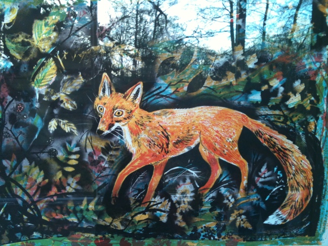
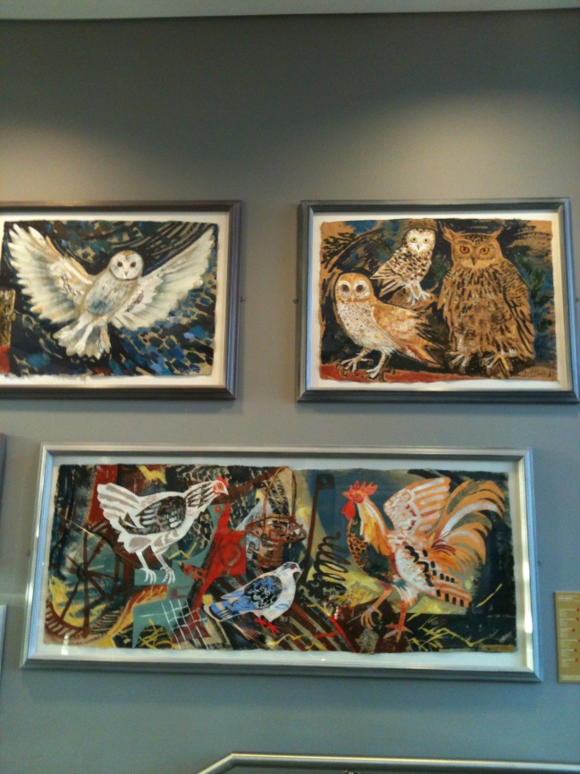
Mark studied Natural history illustration at the Royal College of Art, a subject that remains the focus of his work. The beautiful setting of the Sculpture Park worked very well with the illustrations, collages and prints of British wildlife in all its glory.

It was interesting to see how Mark creates 3D structures or assemblages in a similar way to his collage works. I wanted to see a whole scene created in this way – it would be magical to walk into a ‘world’ created by Mark Hearld!

Image

ImageImage

Mark Hearld


Nike Savvas at Leeds Art Gallery

Image

20130313-075837.jpg

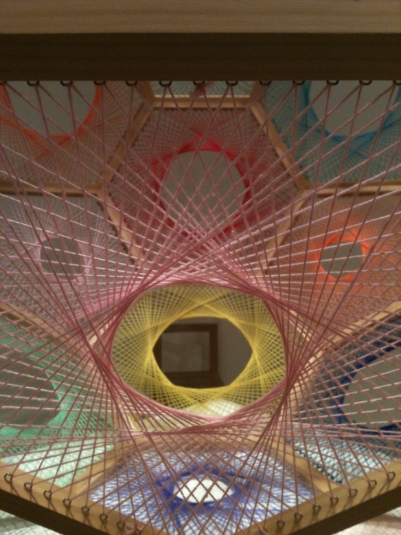
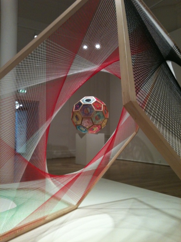
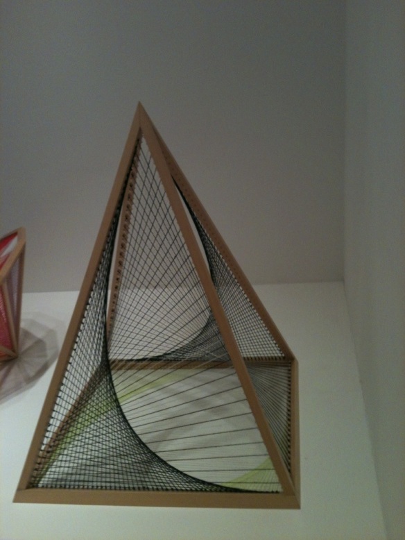
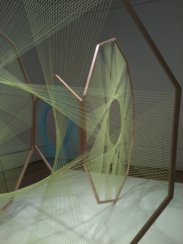
I recently visited Liberty and Anarchy at Leeds art gallery, an exhibition by an Australian artist, Nike Savvas.

20130316-214342.jpg

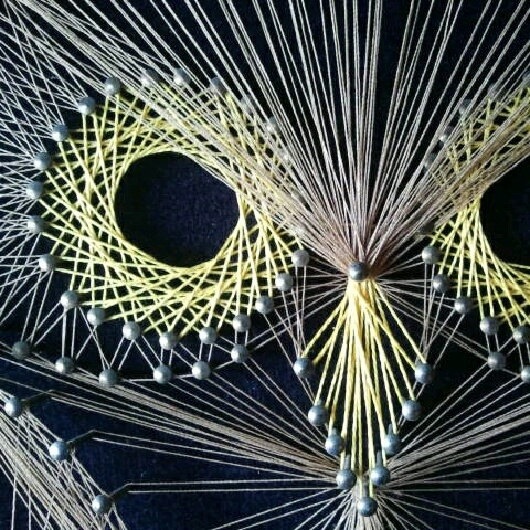
The exhibition featured the above pieces created from wooden frames and coloured thread. These pieces instantly made me think of 70s string art! My grandma has a picture of an owl made by my uncle that looks very similar to the one here.

20130316-215409.jpg

20130316-214401.jpg

20130316-215656.jpg

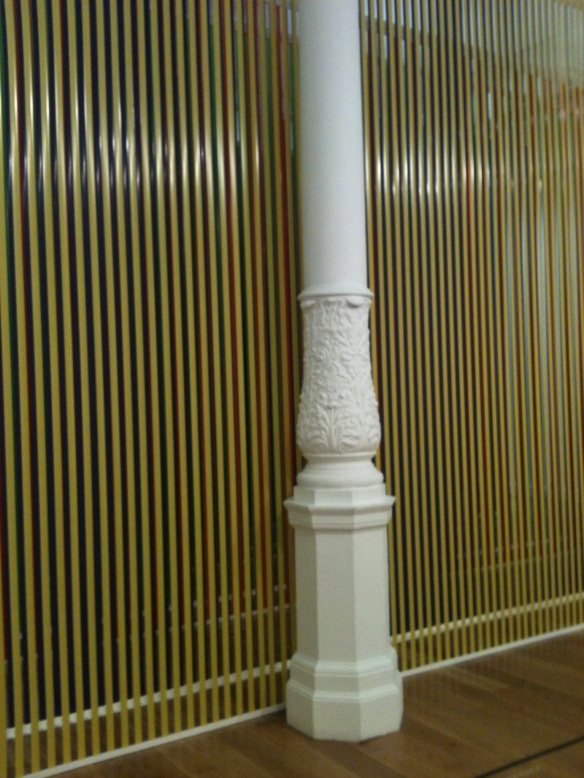
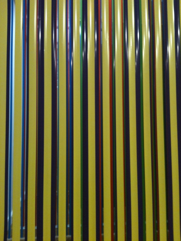
For me the most intriguing and exciting piece was one that had been specially created for the gallery. Assembled from huge frames of coloured tape (?) which stretched far back into the gallery.

20130316-220145.jpg
The strips of tape and the layering effect of the different colours created the illusion of movement.

20130316-221013.jpg

At first I was not sure why the exhibition was entitled liberty and anarchy but when standing in front of this I felt overwhelmed and disorientated but calm and free. It was a great experience!

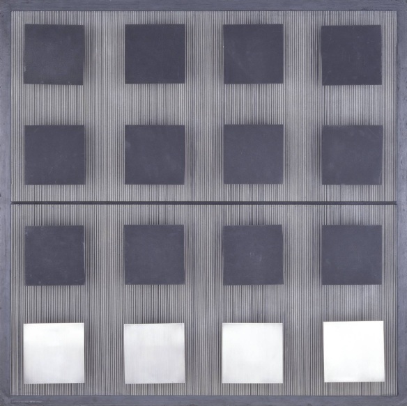
It made me think of a piece by Jesus Rafael Soto called Twelve Blacks and Four Silvers.

20130316-222726.jpg
It’s difficult to see here but when you stand in front of this work the squares seem to float around on the lined background, which is very sillier to the effect Savvas has achieved in her work.

The Designers Republic Car Booty

Last week I attended Car Booty. It was an event by The Designers Republic, where all of the work exhibited was also for sale, hence the name “car booty”.
The evening started in the Porter Cottage, a local pub, with Ian Anderson doing a question and answer session. The Designers Republic have worked with lots of big clients, on famous projects such as Coca-cola, Apex Twin (album covers) and the game Wipe Out. Someone asked if there were any clients that Ian wished he hadn’t turned down. He said that Brian Molko had called him and asked if TDR could do an album cover for his band Placebo. Ian claims he was on his way out at the time, had never heard of Placebo and wasn’t interested.
I asked which project he was most proud of and he said the Coca-Cola summer campaign because he felt it was truly a global campaign; it is purely visual so can be understood by anyone irrespective of any language.

After the question and answer session everyone walked down to the Month of Sundays Gallery, where three decades of work had been crammed into a tiny room. There was a lot to see and in many ways the exhibition resembled a sweetshop (or perhaps more a colourful record shop). Needless to say, there were many grown men (who were obviously serious collectors) running around like children who have just received their pocket money, in said sweetshop.

If you are not familiar with the work of TDR then have a look at what they have done. There are some icon pieces of design amongst their archive. Their industrial, Swiss influenced, minimalistic style has been much imitated over the years. Some of my personal favourites are the NY Sushi flyers.

20121016-074217.jpg

20121016-074208.jpg

20121016-074157.jpg

On Wikipedia there is a lengthy article about The Designers Republic which lists some of the clients and companies they have produced work for. It makes for impressive reading.

Not too long ago The Designers Republic went into liquidation. It was another victim of the recession. They have however, picked themselves up, dusted themselves down and carried on designing. Let that be a lesson to you!

Paint recycling scheme

20121004-071649.jpg

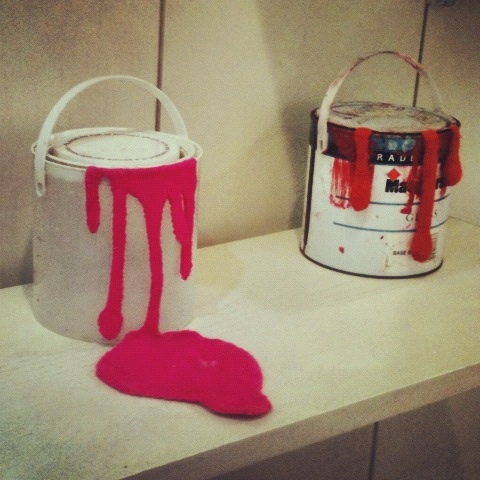
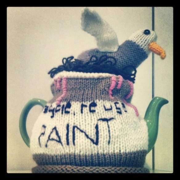
At an exhibition by the Arts and Minds network I saw these pieces which intrigued me. It turned out that the artist is involved with a paint recycling scheme called ‘seagulls’. I’m not sure why it is called seagulls but it is!

20121004-071754.jpg

The scheme is a charity and has been featured on The Secret Millionaire. Excess paint is collected from businesses, organisations and individuals and then sold on. The project also offers a decorating service and runs mosaic making workshops.
http://www.seagullsreuse.org.uk/

Arts and Minds network in Leeds

On my way to the gym tonight I saw that something interesting was happening in an old shop; an exhibition of work by the Arts and Minds network

The Arts & Minds Network aims to bring together people in Leeds who believe the arts can promote mental well being. The network is open to anyone who in Leeds wants to see the growth of arts and health – including service users, carers, mental health workers, artists, arts organisations and mental health organisations.

I met a lovely lady called Joy Pocock who was exhibiting some of her work. My favourite piece by Joy was a crocheted doll that had just given birth.

20121003-215128.jpg
Despite the graphic nature of the subject the doll looked cute and appealing. It captured everything that is good about new life. The colours of the yarn and the fact that it was crocheted made me think of the clothes that a mother might make for her baby when pregnant.

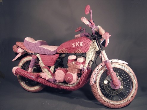
Joy has a website featuring more of her work like this amazing knitted motor bike!

20121003-191728.jpg

<a
The exhibition is on until tuesday 9th October as part of the Love Arts festival. The festival will run until 29th October.

Does your work make sense?

Does your work make sense?
This may seem like a silly question but you would be surprised what makes its way out into the world.
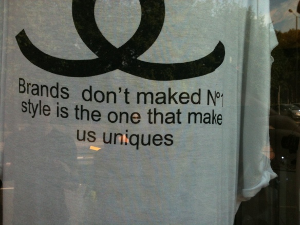
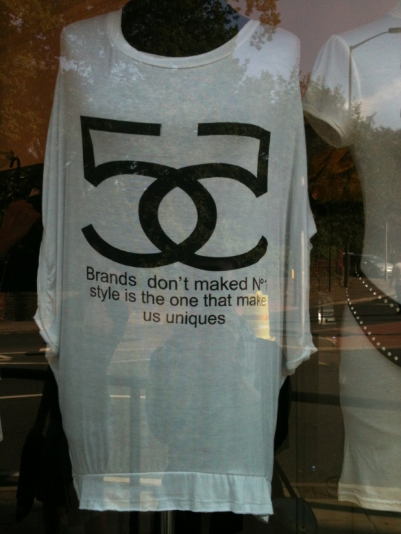
I recently spotted this T-shirt in the window of a fashion boutique.

20120927-172251.jpg

20120927-172301.jpg

Bad design aside, this doesn’t even make sense. How has that T-shirt made its way into a shop window?
Ok, so I can understand how this may have happened: perhaps the t-shirt was created and printed in a non-English speaking country and they translated something incorrectly (google translate)? The thing that I don’t understand is how someone who owns a boutique thought it was a good product, so good that they then placed it in the window of their shop!

Let this be a lesson to you; always check your work for obvious errors, get someone else to look at it and ask the question, “Does it make sense?”

Birthday Clown at The Hepworth

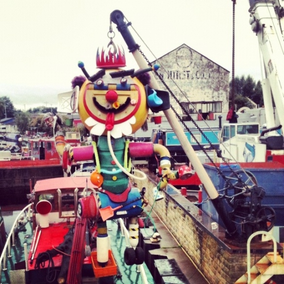
As you approach The Hepworth gallery across a wobbly bridge, you are greeted by this amazing sculpture of a clown. Apparently it was created by the ship yard that is next door to The Hepworth gallery to celebrate the gallery’s first birthday. I have been unable to find out any more information about it, so if anybody knows who created the clown, please let me know.
As you can see from the photographs it has been created from objects found around the ship yard. I especially love the use of a chair for one of the clowns ears!

20120925-072003.jpg

20120925-072014.jpg

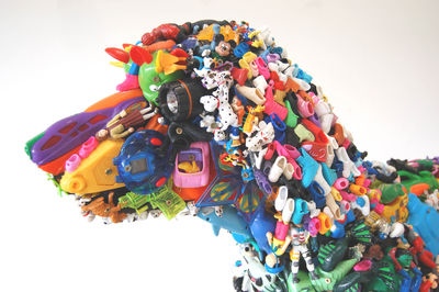
The clown sculpture did make me think of Robert Bradford’s 3D work, which also uses plastic objects, like this dog made from toys.

20120925-192129.jpg

Richard Long at The Hepworth

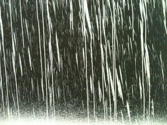
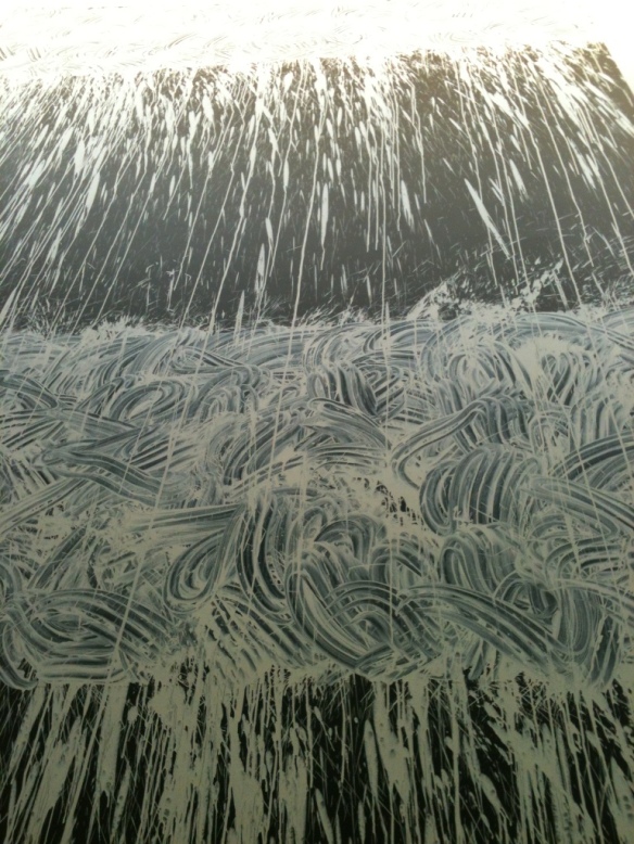
On Thursday we visited the Hepworth museum in Wakefield, where Richard Long is currently exhibiting a number of works. Stone circles, a row of carefully placed sticks and a piece made by flicking white clay onto a black canvas all feature in the exhibition.

20120924-180401.jpg

20120924-180419.jpg

20120924-180446.jpg

Looking at this piece made me feel small; the marks created the impression of a waterfall I could imagine the force of the water cascading down towards me. The different sections of the canvas are created with different marks; in some places the clay has been flicked onto the canvas and in others the artist has smeared it on with his finger tips, you can see the swirling patterns and follow his movements with your eye. The way that the material has been treated gives the piece a tactile quality. Although I was standing in a gallery I felt as though I were experiencing this piece with all of my senses, I could ‘hear’ the rush of water and ‘feel’ the cool, wet clay, I could ‘smell’ damp earth and I could imagine the movements that must have created this work.

20120924-181723.jpg

20120924-181738.jpg

20120924-181752.jpg

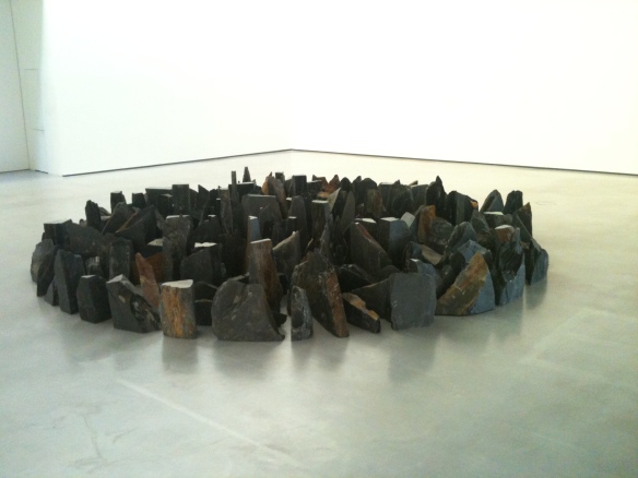
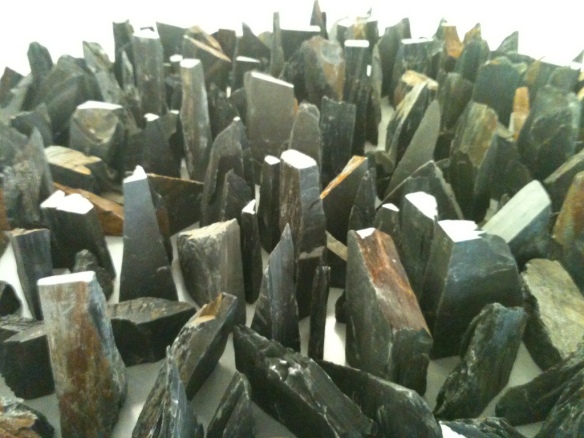
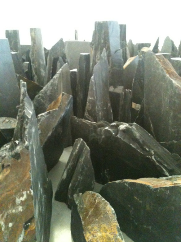
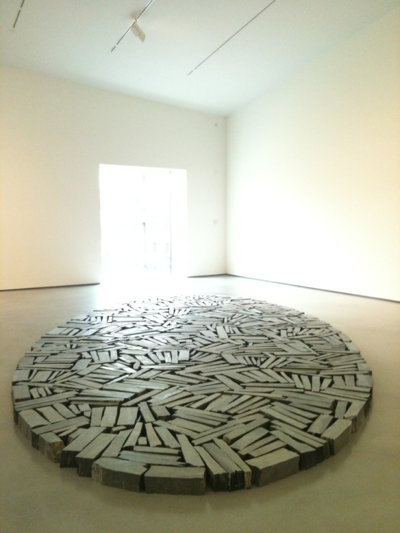
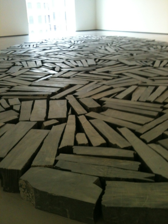
There were two more works in the same room; a circle of jagged rocks (rough pieces of slate) and another made from, smooth cut slate. The contrast between the way the material had been cut was reflected in the arrangement of the stones in each piece. The rough cut stones resembled mountainous terrain whilst the smooth stones could be likened to that of a paved path or road, perhaps one we would find traversing through the mountains. The arrangement of the stones in circles makes them feel contained and solid but at the same time they invite you to walk around them.

20120924-183230.jpg

Experiencing these works together made me think of water flowing over rocks and around obstacles. My perception of scale was altered as I moved between the works; I felt small when looking up at the white clay ‘waterfall’, then gigantic when looking down upon the ‘miniature mountain range’ of rough slate. The cut slate circle brought me back down to earth, as I was once again human size, walking on the mountain path.

You can read an article about Richard Long from The Guardian here.

20120924-183257.jpg

20120924-184316.jpg